Executive Dashboards have been a key tool and resource for C-suite executives as long as data and analytics have been around, so a while. The evolution of dashboards has led to more in-depth and interactive tooling, however the core needs of an executive remains KPIs and metrics that allow them to quickly and effectively understand how the business is performing.
The core needs of speed and efficiency should be at the heart of how you create and manage an executive dashboard, but there are also several design principles that should be taken into account. With this post we will dive into the best practices when developing a dashboard for your executive team, focusing mainly on those executives who look at user behavior data.
What is an executive dashboard?
Fundamentally an executive dashboard is no different than any other dashboard your analytics or BI team creates for other functions of the business. It should consist of relevant and trusted insights that allow for fast decision making. Where they begin to differ is the substance and detail included in an executive dashboard vs. any other.
An executive needs to see KPIs first and foremost and in the simplest terms possible. This is not to diminish the complex calculations or various inputs of that KPI, more so it demonstrates how valuable these metrics are at communicating complex information. Designing the proper KPIs are another topic entirely but some common ones that should be included are expanded upon below.
Additionally these dashboards should be accessible to the executive whenever he or she needs to see them. This allows for self-service and reduces the speed between an executives question and the relevant information to answer or help answer it. When selecting a tool to deliver this information it’s important to consider ones that don’t require human intervention prior to sharing it.
Let’s look deeper into the type of information typically included in an executive dashboard, and a few you may want to consider.
What you should include on an executive dashboard
The question of what a dashboard should include entirely depends on what the Role and Goals of the executive are. Most often each team or line of business (LOB) have their own slice of data and dashboard that dive deep into these given areas. As mentioned above, executive dashboards need a summarized view of this complex world and are often composed of parts of these LOB dashboards.
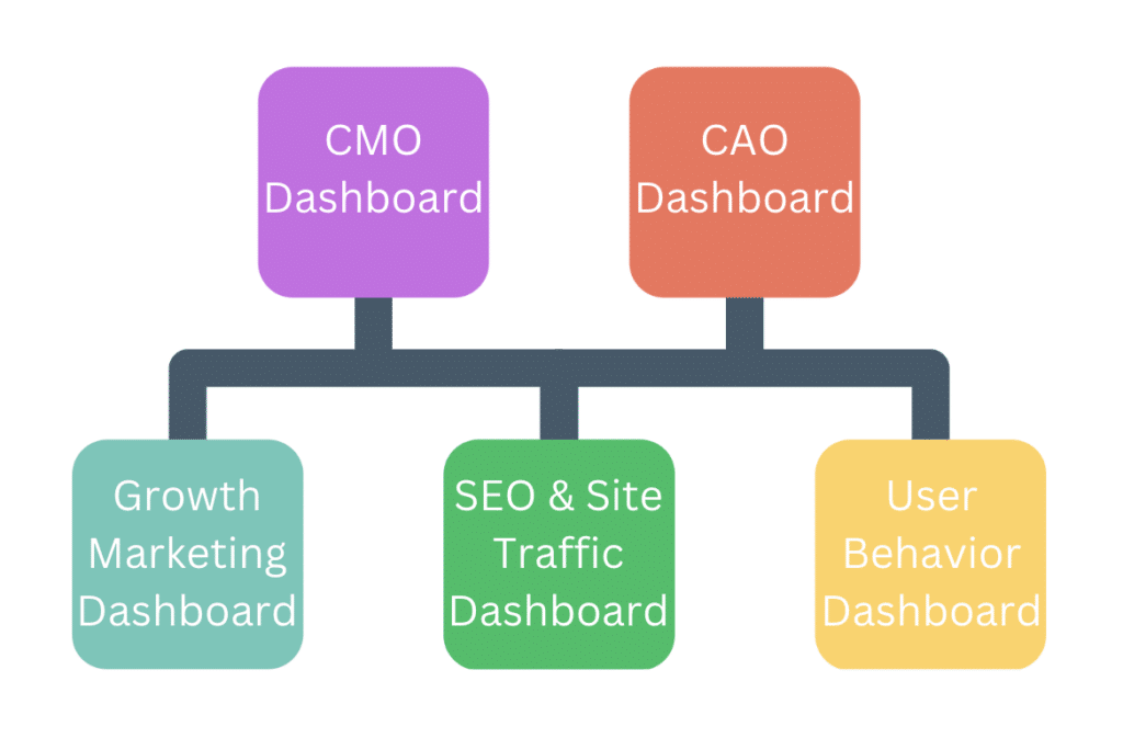
A few best practices when designing these executive dashboards include:
| Relevant Time Period | Consistent Naming | Critical Metrics Only | Context When Possible |
| If the executives typically look back and plan forward Quarterly then ensure the intervals of time align with that view point. It’s less useful if a report is Daily but the CMO plans Monthly. | Ensure that any common nomenclature or terminology is carried onto the Dashboard. Acronyms should also be defined to remove any possible confusion. | Include only the top KPIs and summarized metrics. If the dashboard contains too many details it can be difficult to know what’s a KPI vs. a subset of metrics. | Most often the numbers presented have a story behind them. It can be valuable to include a summary of this story or incident that may allude to the metric displayed. I.e. Data outage, large campaign, holidays. |
Let’s break down these best practices framed by a few executive roles Kubit sees leveraging executive dashboards. A good rule of thumb is to keep it short and simple, a dashboard with more than 7+ reports is difficult to navigate so you should challenge yourself to keep it under 7 charts.
CPO – Chief Product Officer
Across industries a Chief Product Officer (CPO) often needs to get a broad view of how users are adopting, growing and maturing through their product(s). This becomes especially important if your business has several products that promote one another. A few core KPIs we see with these types of executive dashboards include:
- Daily/Weekly/Monthly Active Users
- You can learn more about how Kubit recommends you define an Active User with this recent blog post.
- A summary of those users based on their current status or maturity
- This typically includes a definition of New, Existing and Dormant users.
- Seeing this breakdown will best illustrate what segment comprises your average user base.
- Conversion Rate of a core flow i.e. Login or Purchase
- This should be a flow that nearly all users are expected to do or denote value within your product.
- Top KPIs defined by your product managers that ladder to specific areas of user engagement.
- These are typically called “Input Metrics” and include things like:
- Average Sessions per User
- Average Engagement Events per User
- % of Users Who performed X event(s)
- Average Duration of Sessions
- These are typically called “Input Metrics” and include things like:
- A North Star Metric that encompasses the successful value exchange between your product and the user.
- A North Star Metric can be difficult to design but when done correctly it gives the best possible picture of how the product is performing.
- Examples include:
- Average Session Duration per Paying User
- Average Checkout Value per Loyalty Member User
- Average Minutes Watched per Paying User
- Furthermore if you have several products your CPO is responsible for you can add another layer of Avg Products per User to understand if cross-sell or upsell strategies are working.
- Also provide a filter control within the dashboard to allow the CPO to filter to a specific product or product line.
CMO – Chief Marketing Officer
From our experience a majority of CMOs focus on two things:
How good are we at attracting new customers to our platform or service?
- How good are we at attracting new customers to our platform or service?
- How efficient are we at converting those new customers into paying or returning users?
Most often teams will have a good idea of #1 because Marketing data like impressions, clicks and click through are tracked using a single toolset or tagging infrastructure. We typically see this data generated by looks like Google Analytics, Braze, Iterable or the various other Marketing Acquisition Tools. These do a great job of collecting this data in a standardized way across platforms and products.
An added benefit of leveraging tools like GA is that you typically can see ad spend next to the impression and click through data so CMOs can quickly see ROI on their team’s efforts. ROI will be a critical KPI for most CMOs so taking steps to attempt to bring the ad spend data next to the user behavior (i.e. impressions and clicks) is something we recommend marketing teams investigate and attempt.
Inversely #2 is the most difficult data for CMOs to see as the outcomes of their efforts are left to be collected and analyzed by the CPO and the data no longer exists within their marketing toolset. Tools like Kubit will help connect the dots between these two datasets as both often live within the data warehouse and can be analyzed within Kubit.
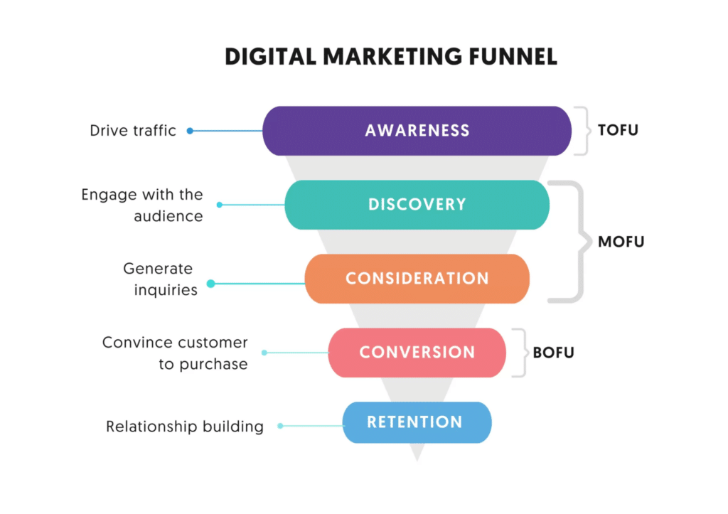
A few core KPIs we see with CMO executive dashboards include:
- User Acquisitions from various marketing channels like search, social media and email.
- This metric refers to counting the number of users on your platform or site that were referred by your marketing channels.
- High value Conversions via emails, ad and organic channels that you can tie to product growth.
- Also referred to as Click Through Rates and you’ll divide the number of impressions by the number of clicks typically by marketing channel.
- Primary SEO metrics if that’s a point of focus for your Marketing organization.
- This includes domain rankings, backlinks, keywords, content spend etc.
- Reputation signals from 3rd party reviews and testimonials.
- Even better if you have a portal that can send this data into your data warehouse for easier analysis.
- Often though this data comes in spreadsheets and not connected to a specific user, if the data is challenging to fit into a data model best to leave it out of the dashboard and share ad-hoc.
- Presence on social media page likes and follows to ensure your audience is growing and engaged.
- These numbers are also often retrieved from 3rd parties or you can purchase a social media monitoring system and collate data across social networks for easier reporting.
- Product and site traffic, conversion and engagement metrics from your acquisition audience.
- This piece is critical to understand if the gains seen in the top of the funnel translate to long term users and revenue.
Why are executive dashboards important?
Executives are busy and have dozens of workstreams, initiatives and goals they are tracking at any given time. The best lifeline and resource they can have is reliable and well organized data to aid in their decision making. Executive dashboards provide this information and should be a centerpiece of any executive’s regular tasks, which means they are probably one of the most important things to any c-suite.
What happens when this information isn’t readily available? In short, gut instinct and intuition take a front seat in most decision making. While those two things are incredibly valuable attributes of an executive it doesn’t mean they are seeing the entire picture which leads to blindspots and missed opportunities. Executives are asked to make big sweeping decisions that could impact people, process and technologies across portions of an organization so asking “What are executive dashboards important?” is frankly a silly question… even though I just asked it!
In short, they are incredibly important and to summarize why:
- Improves decision making
- Reduces speed to insights
- Provides transparency across the organization
- Improves communication between cross-functional teams
How to use Kubit to build an executive dashboard
Kubit has several features that enable valuable executive dashboards and with our warehouse-native architecture bringing data from various sources together is made easier. In traditional tools that let you analyze user behavioral data you’re often limited by what that tool collects or the format of data it expects. Because Kubit has a “bring your own data” model we can mold to your unique data structure.
A few core features of Kubit specific to executive dashboards include:
Rich Text in Dashboards
Add rich text to dashboards which allow you to infuse story, context and resource hyperlinks alongside the data.
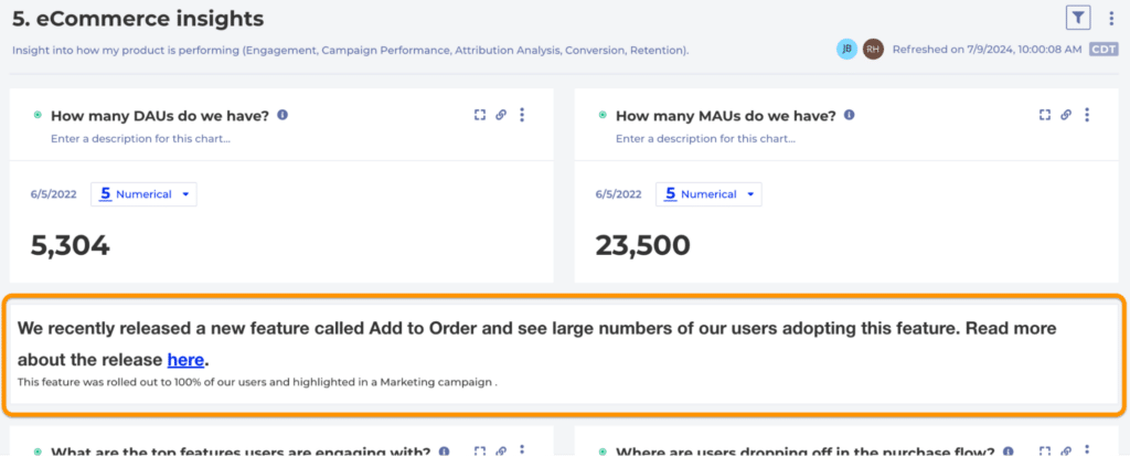
Incidents in Kubit
Create Incidents in Kubit to highlight critical releases, outages, campaigns or holidays that would impact KPIs. This means executives can toggle this information on and quickly get context without reaching out for more information.

Dashboard Schedules
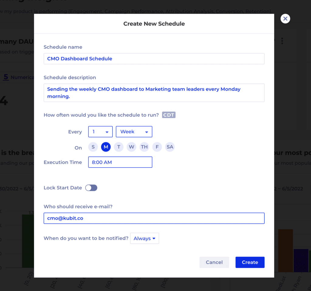
Schedule dashboard refreshes and send emails regularly to automate the distribution of this information via Kubit’s UI.
